
June 1, 2024
Product Updates: Array Data & Operating Plot Functionality
By Mike Aanenson · 2 min read · Product
The influx of data into an Industrial IoT platform for condition monitoring originates mainly from edge devices, presenting a mix of numeric, string, and boolean data sourced from sensors, tags, and status updates. Picture temperature sensors and boolean value tags sourced from Modbus registers. This data can be plotted over time, displayed in a chronological log, or used as the latest value for driving various visualizations and indicators.
In some cases edge devices source and analyze data that is two dimensional, such as when looking at vibration, which requires analyzing frequencies vs amplitudes at that point in time. There are also situations where two pieces of sensor information are compared and used as an operating point or operating line, such as a pump curve.
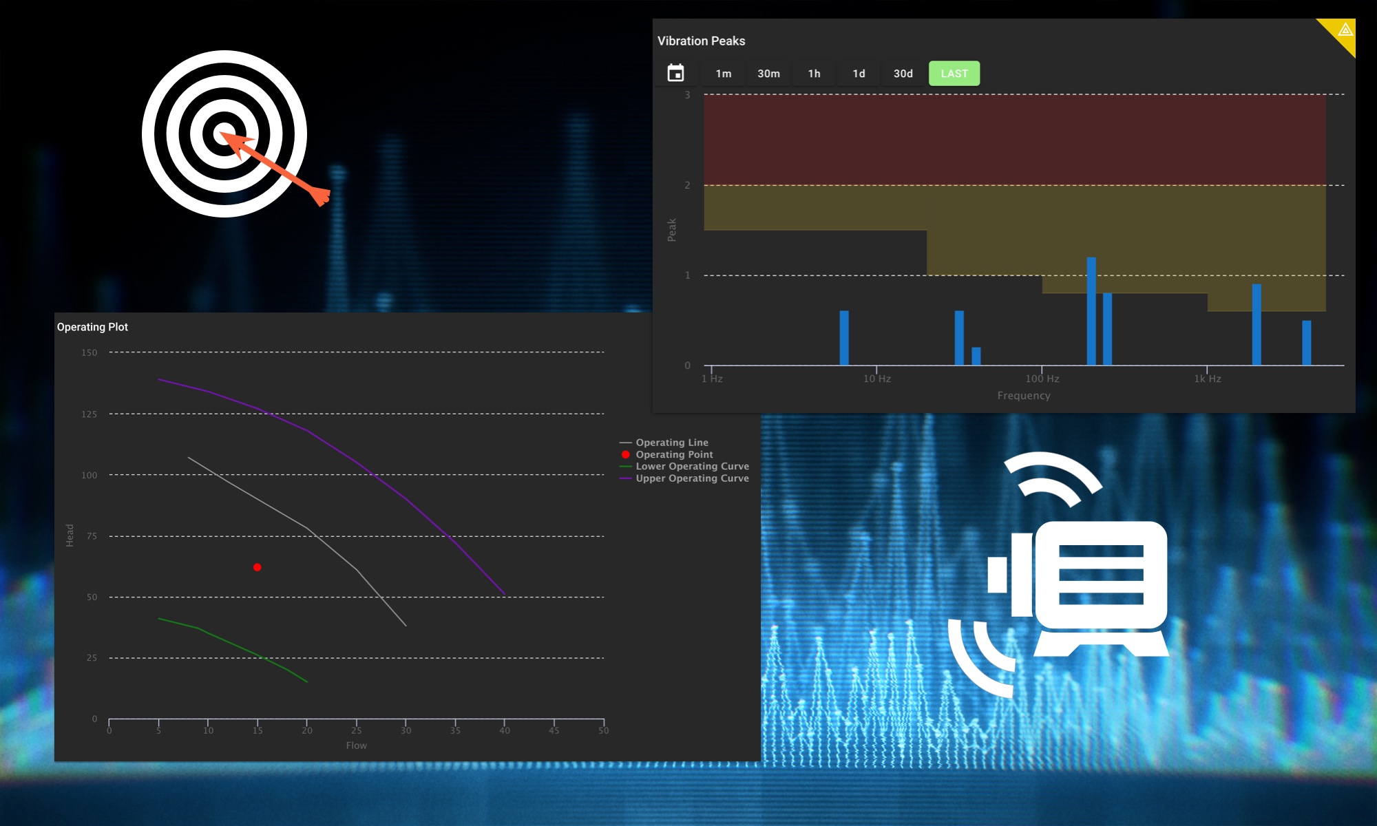
ExoSense supports array data values in its data pipeline for such cases and includes functionality for Array Data Rules, an Array Data Chart panel, and an Operational Plot panel.
Note: For large and/or high resolution data sets such as a full FFT, a large heatmap data set, or a historical log, ExoSense supports uploading files and other content for visualizations and download.
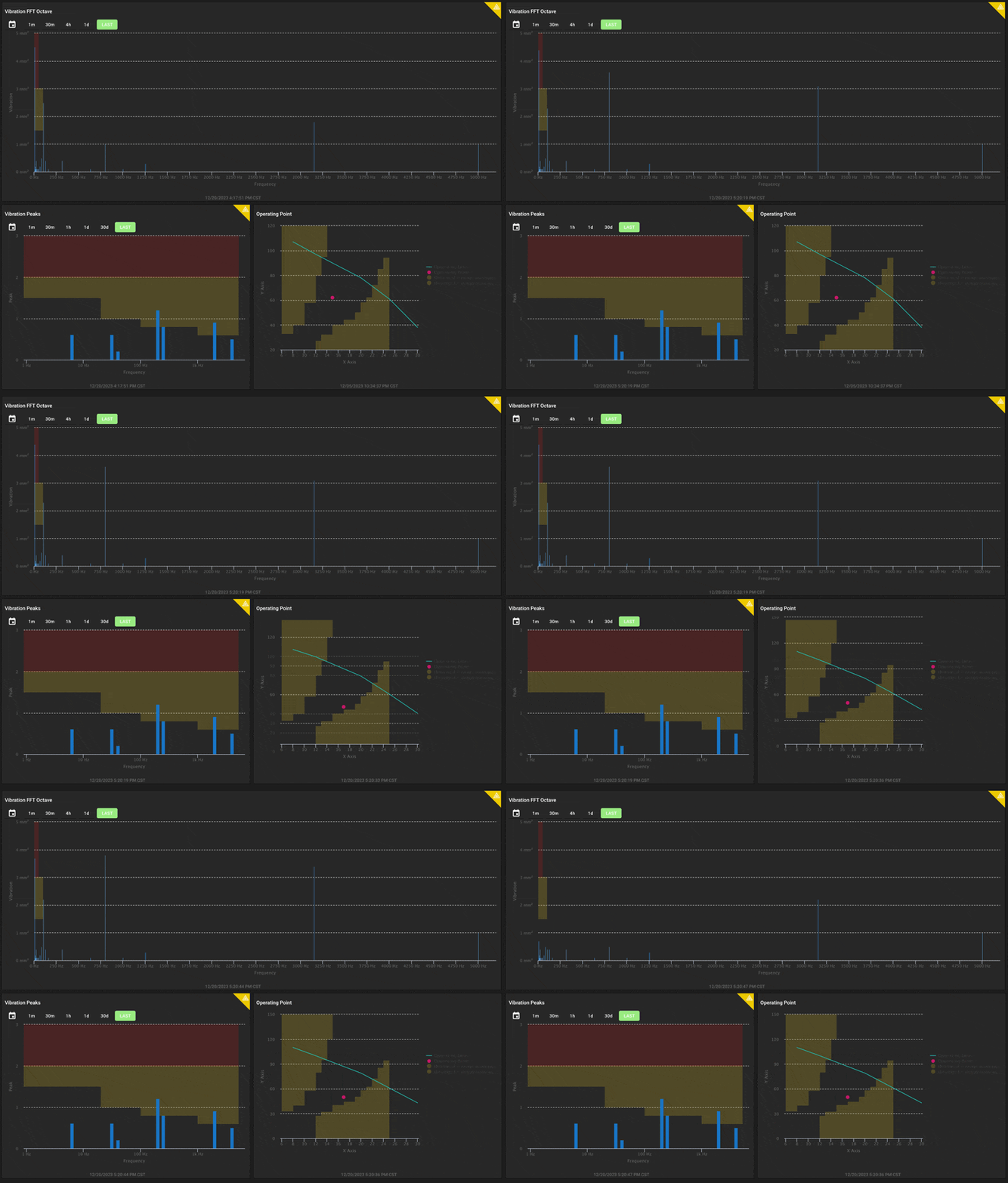
Array Data Dashboard Panel
The ExoSense Array Panel plots arrays of pairs and arrays of numbers on a chart, with lots of customization options for axis, scale, and units. It supports both full points and providing an array of numbers which can be mapped to a static array of X coordinates.
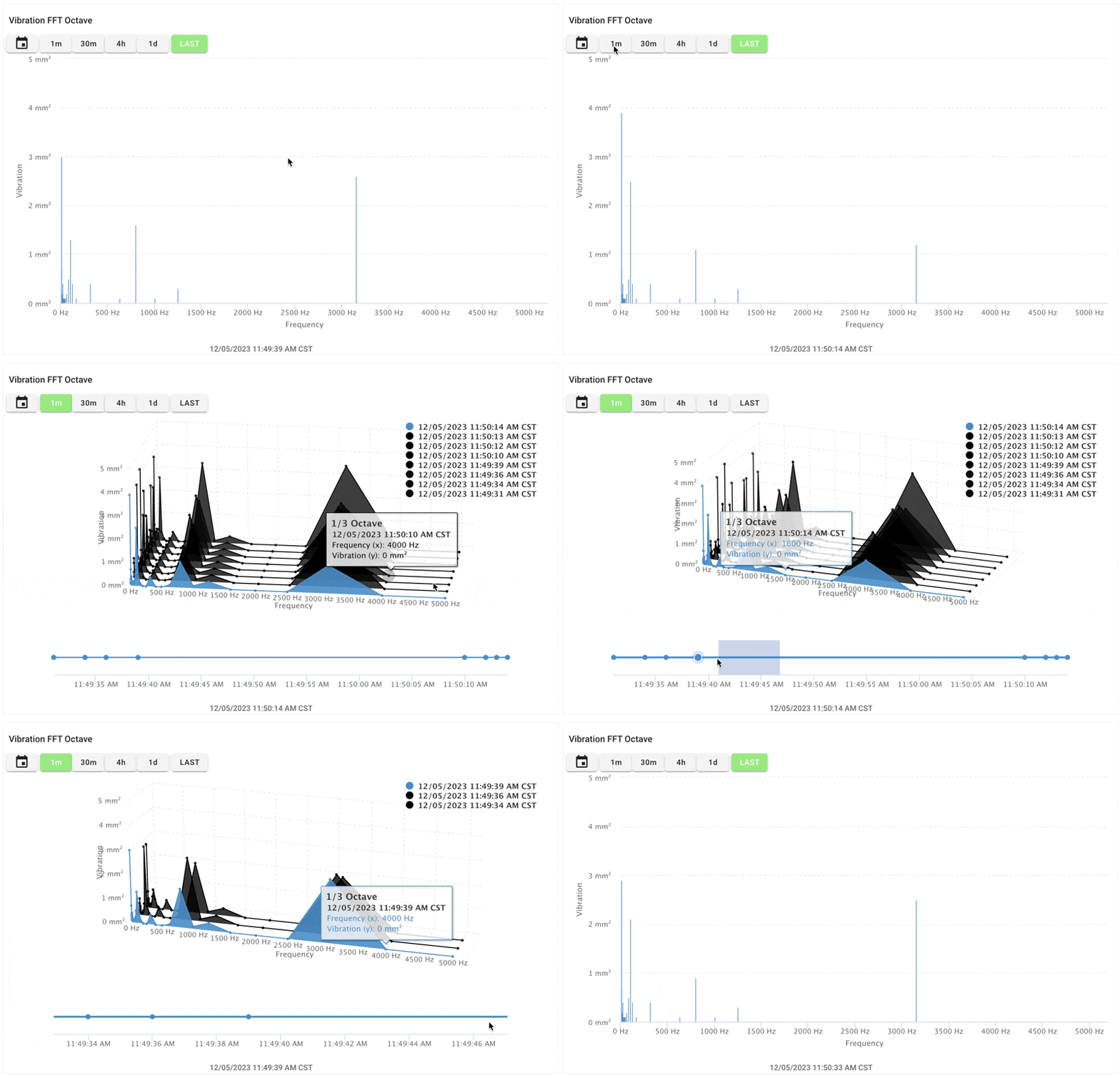
An example use case is by sensors that are constantly taking vibration readings and producing a subset of a Fast Fourier Transform (FFT), such as a fractional octave spectrum or a set of max peaks. This set of data contains amplitudes and frequencies at that point in time to provide a snapshot of vibration at that time.
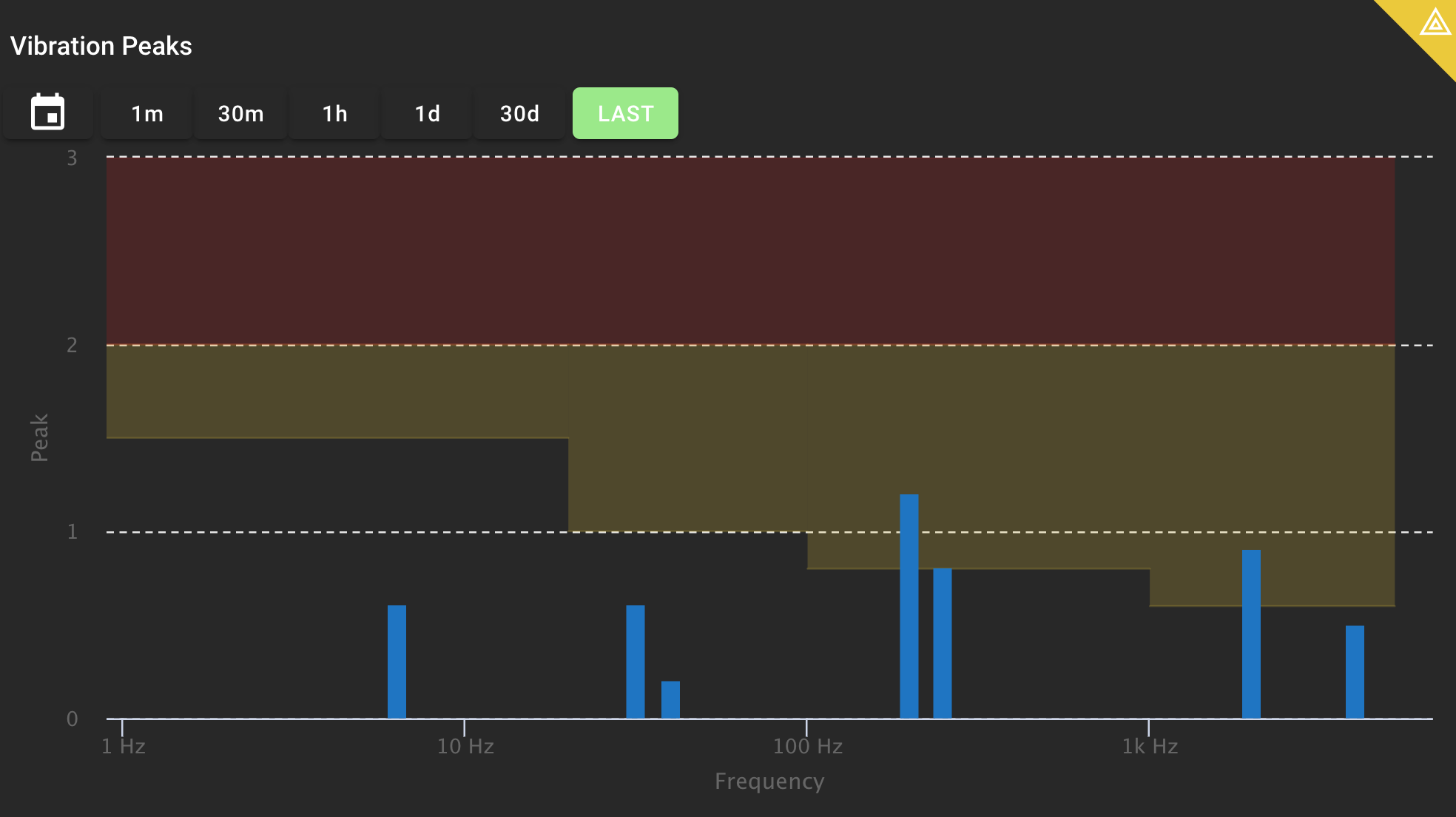
Operational Plot Dashboard Panel
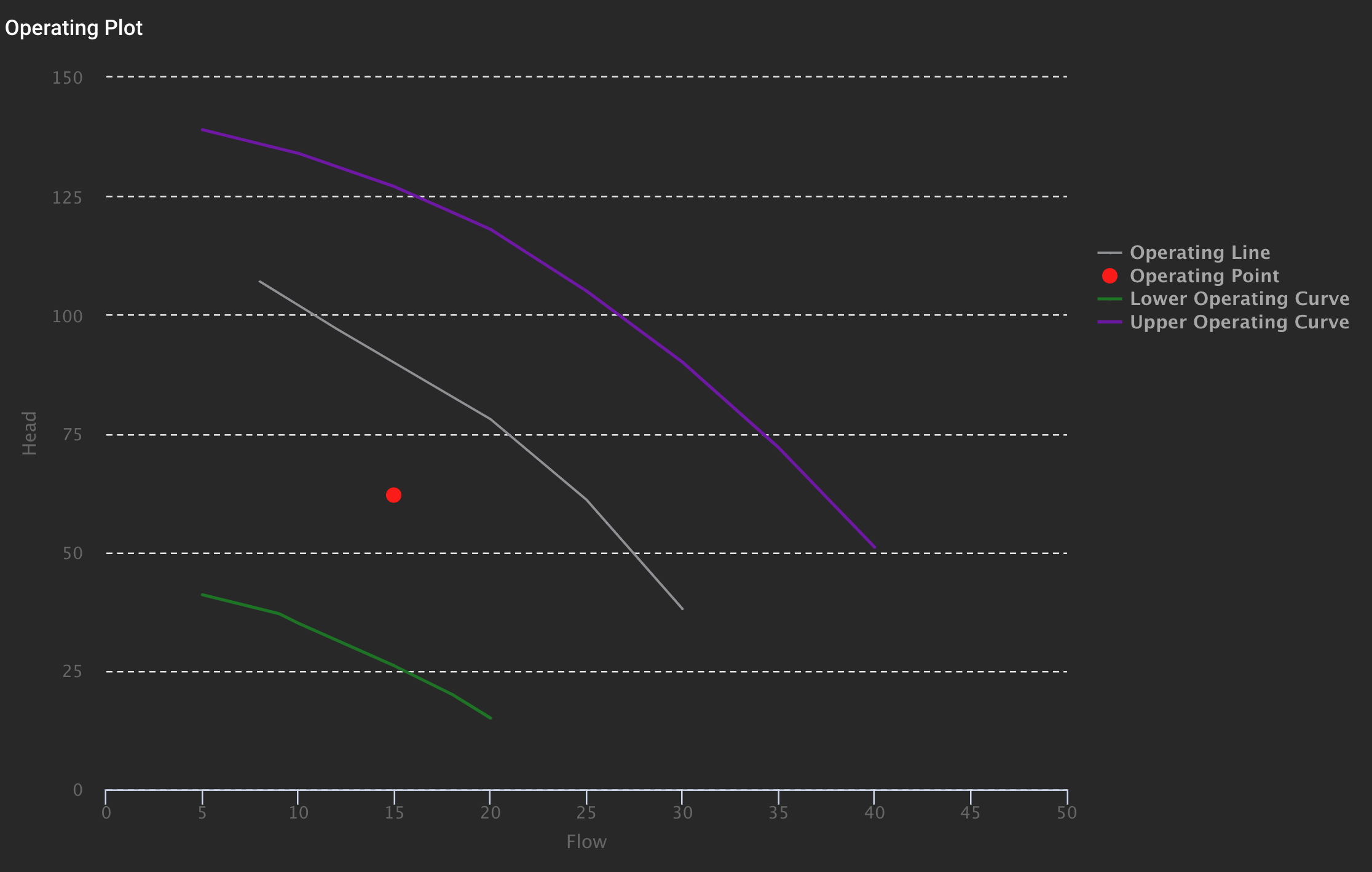
For data that needs to be compared as operating points, the ExoSense Operational Plot panel can be used to chart one or more sets of data against dynamic or static data sets. Arrays of points can be displayed as a connected line or as a scatter of points. These dynamic points and lines, flowing as pipeline signal data in ExoSense, update in realtime.
ExoSense Operating Plot Panel Documentation
Pump Curve Example: Many pump applications look at Head vs Capacity or Flow. Having this in realtime allows users to get a sense of how the unit is operating against expectations. This is applicable to many other machines and systems that have an expected operating range or in performance / health use cases.
Want to learn more about using ExoSense to monitor dimension data sets? Schedule a Demo.